

“Linnéa not only took the challenge, she just made it her own. She brought in ideas and concepts that were new to us.
"Linnéa not only met with our board, she met with our presidents of the hospitals, she met with our CTOs of the clinics,... She did it like a seasoned professional.
“Through every milestone of the project, every time we would see a color palette, Linnéa would describe what book she was using, where she was sourcing this out on the web,... If we were looking at logos, she would show us competitive logos...
“Having that knowledge, and having Linnéa walk through that with me, benefitted me in ways that I could never have done on my own.”
— Stephanie Dozier, Connxus Executive Director
CLIENT
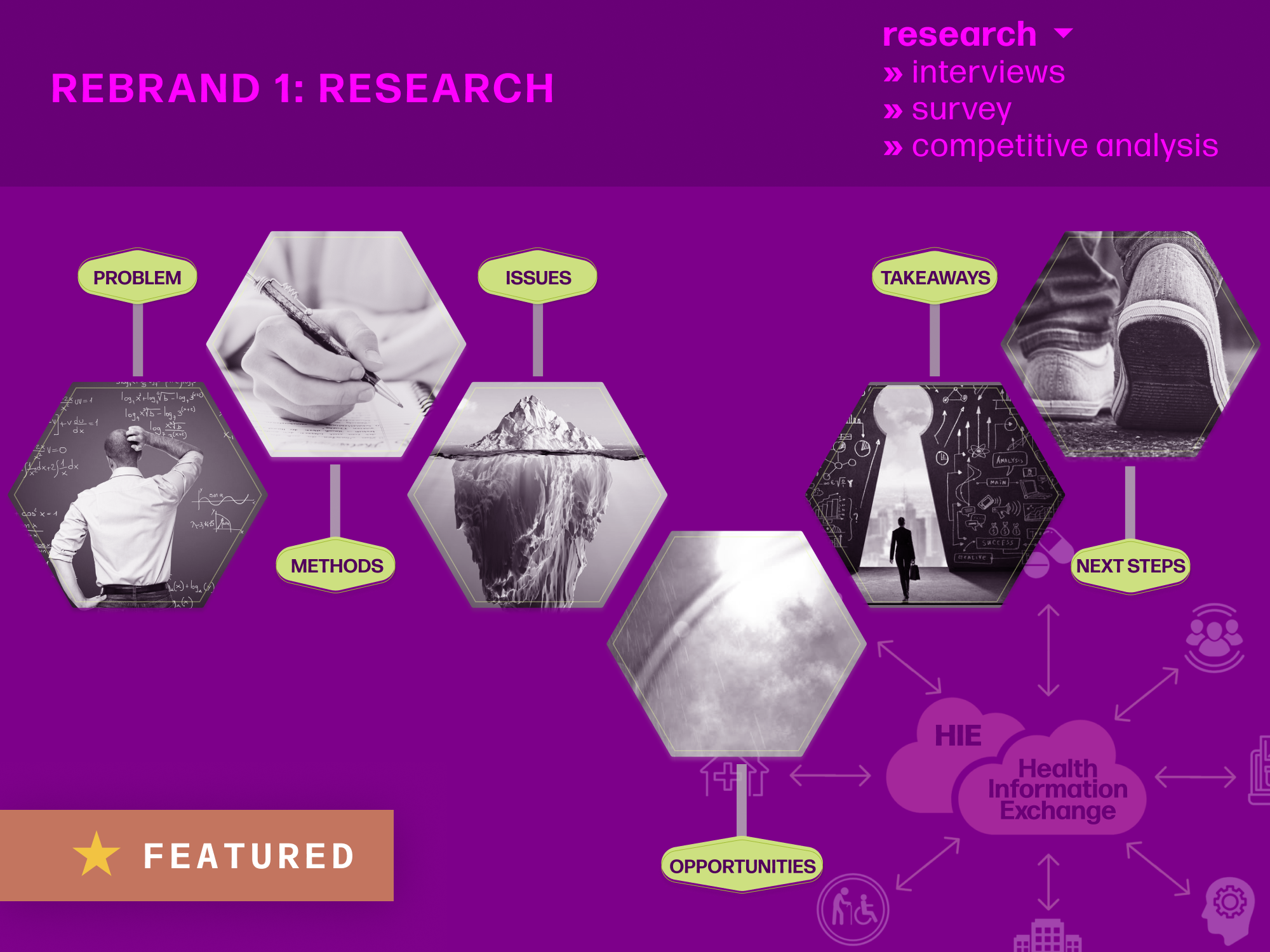
METHODS + TOOLS

A Central TX Health Information Exchange (HIE)
—Project facilitated via UT CONNECT program—
—Project facilitated via UT CONNECT program—
• interviews
• CONCEPT TESTING
• Competitive analyses
• BACKGROUND research
• MockupS
• Brand Style Guide
• CONCEPT TESTING
• Competitive analyses
• BACKGROUND research
• MockupS
• Brand Style Guide
• Figma
• Microsoft Office
• Google Suite
• Zoom
• Microsoft TEAMS
• Microsoft Office
• Google Suite
• Zoom
• Microsoft TEAMS
THE PROBLEM
MY ROLE
Organization stagnation. Healthcare organizations had stopped joining Integrated Care Collaboration (ICC), and stakeholders were uneasy.
PRIMARY Questions:
— Why have organizations stopped joining? (Part 1)
— How might ICC address their concerns? (Part 1)
— How might ICC rebrand for growth?
— How might ICC address their concerns? (Part 1)
— How might ICC rebrand for growth?
UX Researcher • UX Designer
This was a multi-stage project facilitated by the CONNECT Fellowship program at the University of Texas at Austin.
I planned, implemented, and communicated everything from end to end, working closely with a trio of ICC employee stakeholders to ensure their input, understanding, and buy-in throughout the process.
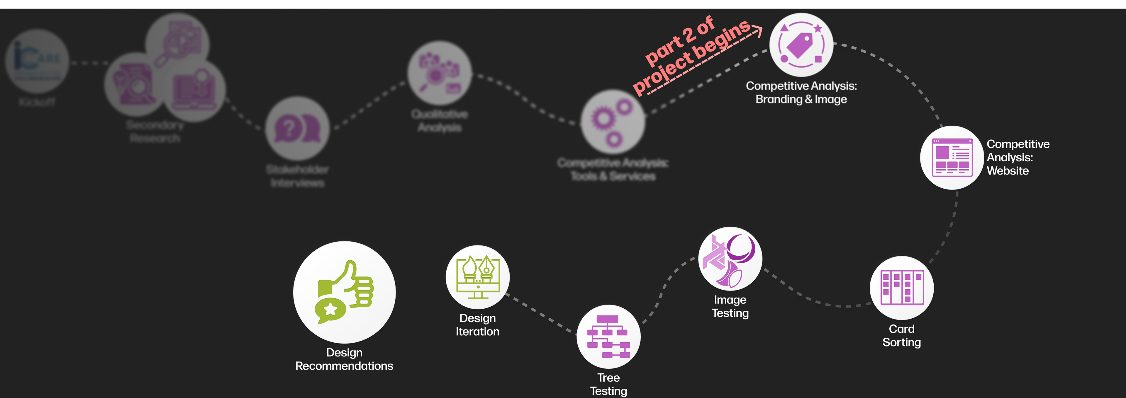
Project roadmap
First, a quick definition —
What is an HIE?
A Health Information Exchange is a system that allows doctors, nurses, pharmacists, other healthcare providers and patients to securely access and share a patient’s vital medical information electronically—improving the speed, quality, safety, and cost of patient care.
HIEs can take different structures, but we'll be focused on ICC's: a centralized exchange. This takes the form of a single repository that stores all patient data, managed by the HIE.
HIEs serve diverse users with divergent needs. At the time of this project, many were struggling, failing, or getting absorbed by larger interoperability organizations.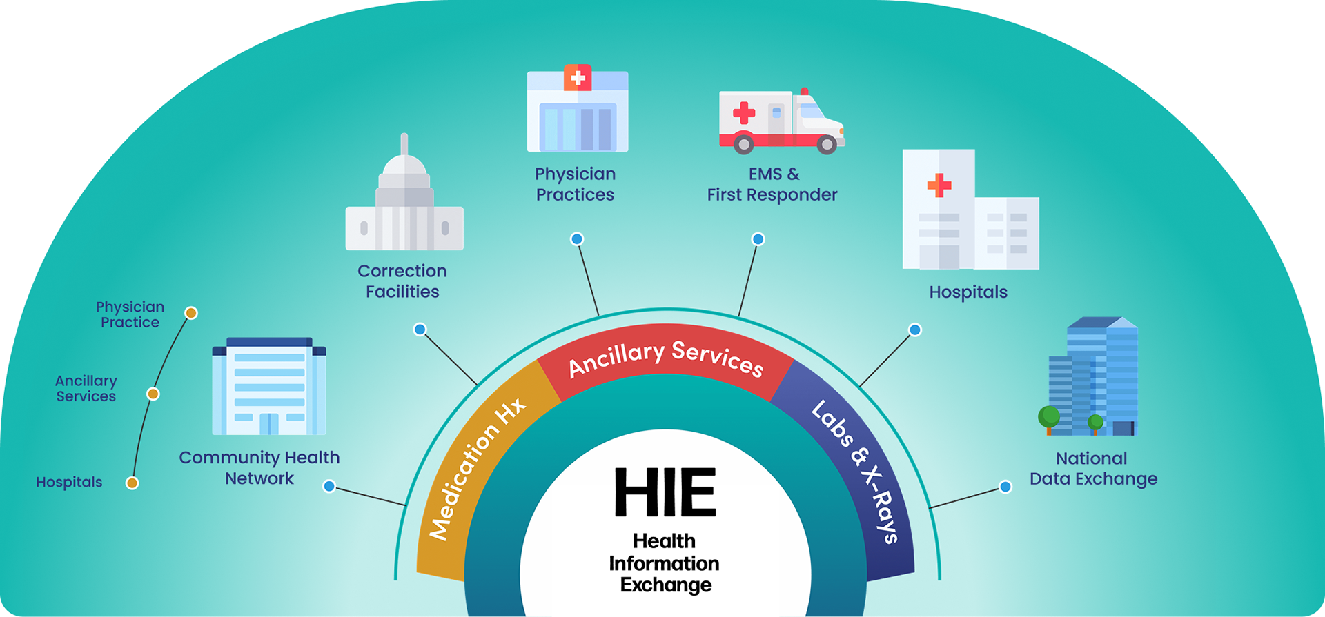
Now for Part 2—
REBRAND VISUAL DESIGN
REBRAND VISUAL DESIGN
Quick Caveat: This pair of case studies reads linearly for ease of comprehension, but the project, itself, was anything but: steps overlapped, looped back, and influenced each other regularly.
If you'd rather skip to the reveal, check out this presentation-style walkthrough of the full rebrand design phase—
Overall Objectives
• Differentiate from the staid HIE reputation
• Disconnect from the medical healthcare-centric perception of HIEs
• Finalize brand identity attributes ("pillars"). Final list:
— Innovation
— Connection
— Wellness
— Empowerment
— Equity
— Innovation
— Connection
— Wellness
— Empowerment
— Equity
• Create a refreshed brand image, emphasizing these pillars
• Incorporate room for growth in new directions
The Name
The naming process began with examples of competitors' naming schemes. Ideation branched out to consider conceptual, thematic, and etymological relations to the organization's five pillars, and even expanded to consider other languages, relevant mythology and associations, and beyond.
The rest, of course, was a whole lot of iteration—in fact, there was so much discussion, iteration, reframing, and more iteration that the name was among the last of the brand elements to reach consensus among my three stakeholders.
[ T L ; D R ] In the end, we settled on connxus, because:
Connectivity is a vital aspect of their work, both in terms of connecting data across networks, and in supporting ties across the community for greater equity, wellness coordination, and empowerment
Stakeholders favored the ties to modernity (and therefore innovation) in using all lowercase, commingling two words, and "misspelling" with an uncommon letter ("x")
"Us" further cements the organization's immersion within the community and their collaborative mindset
It's easy to pronounce
No trademarks existed in similar industries
It's easy to pronounce
No trademarks existed in similar industries
COMPETITIVE ANALYSIS: NAMING

Patterns in competitor naming were clear: acronyms abounded, and non-acronyms almost universally referenced data connectivity and/or health.
A single outlier—the sequoia project—instead much more subtly alluded to connectivity and growth through the name of a famously large tree species and the stylized roots in the logo. This approach more strongly conveyed a conceptual understanding of the organization than meaningless, easy-to-forget acronyms, and expanded beyond the overdone HIE theme of (medical) "health."
The idea of connectivity also held promise, as it closely aligned with one of ICC's primary pillars: collaboration.
IDEATION: NAMING
Ideation for the name primarily took the form of lists: free association, synonyms, and wordplay for each of the pillars and key aspects of the organization (services, value propositions, relationships).
Toward the end of the process, it sometimes seemed like we were just spinning our wheels—then one day, something clicked. My pitch for an option very similar to others we'd discussed suddenly just felt "right" for my stakeholders. Sometimes, balancing disparate perspectives in design decision-making takes some serendipity—a convergence of right time, right place, and right mindset.
THE FINAL NAME
connxus
Color Palette
Brand palette creation began with competitors, then expanded to encompass color theory and associations.
Color was key in this rebrand: The palette needed to differentiate the HIE from others, branch out from the typical healthcare-centric perception, and support their pillars of innovation, connection, wellness, empowerment, and equity.
[ T L ; D R ] In alignment with the new brand identity—boldly different, expert yet cheerfully welcoming—the final palette incorporated quite a spread of vibrant, mostly tertiary colors. The extended palette also offered a straightforward solution to at-a-glance differentiation between services they offer: "color-coding."
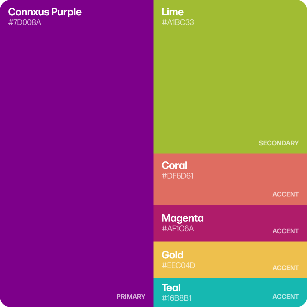
Primary
Purple: to emphasize differentiation, originality, and innovation
Secondary
Lime: for freshness, wellness, and its complement to the primary
Accents
Magenta, coral, and gold: warm tones to underscore the organization's welcoming energy
Teal: a hint at healthcare origins that balances out the palette
Here's how we got there...
COMPETITIVE ANALYSIS: COLORS
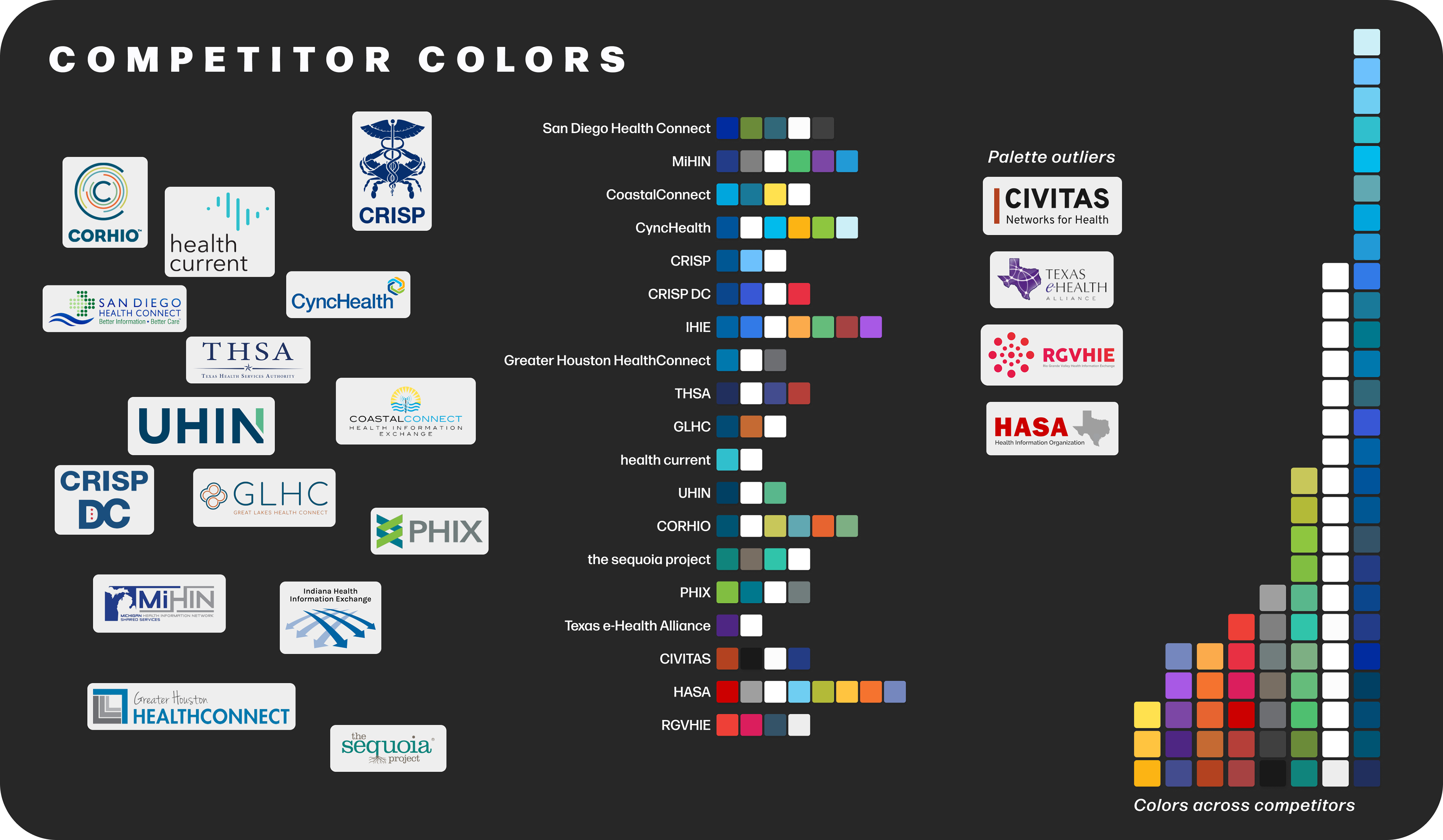
Most competitors relied on blue-dominant palettes—a conventional healthcare choice tied to trust and professionalism. ICC stakeholders, however, weren’t seeking convention. They aimed to move beyond the staid, institutional image typical of HIEs and position themselves as a forward-looking organization addressing broader social determinants of health—including housing, employment, food access, and transportation.
A few outliers (e.g., CIVITAS, RGVHIE, HASA) leaned into warm tones like red and orange. While visually distinctive, red's associations with urgency and harm made it a less fitting option. Instead, we agreed to pursue a more balanced, values-aligned palette to support a fresher, more inclusive brand identity.
Key Takeaways: Color Competitive Analysis
Over-reliance on Healthcare Imagery and Tone
Most competitors leaned heavily on traditional healthcare cues—blue-dominant palettes, medical imagery, and language centered on care and professionalism. These cues created a clinical tone and reinforced narrow, provider-facing perceptions of HIEs.
Insight
These conventions ran counter to ICC’s rebranding goals of modernity, inclusion, and community relevance.
Recommendations
— Explore visual and conceptual ties to broader themes: community, support, data, and innovation
— Use blue sparingly—as an accent or secondary color—to signal continuity without reinforcing limiting associations
— Avoid clinical imagery in favor of more human, local, or tech-forward visuals
Color Mockup
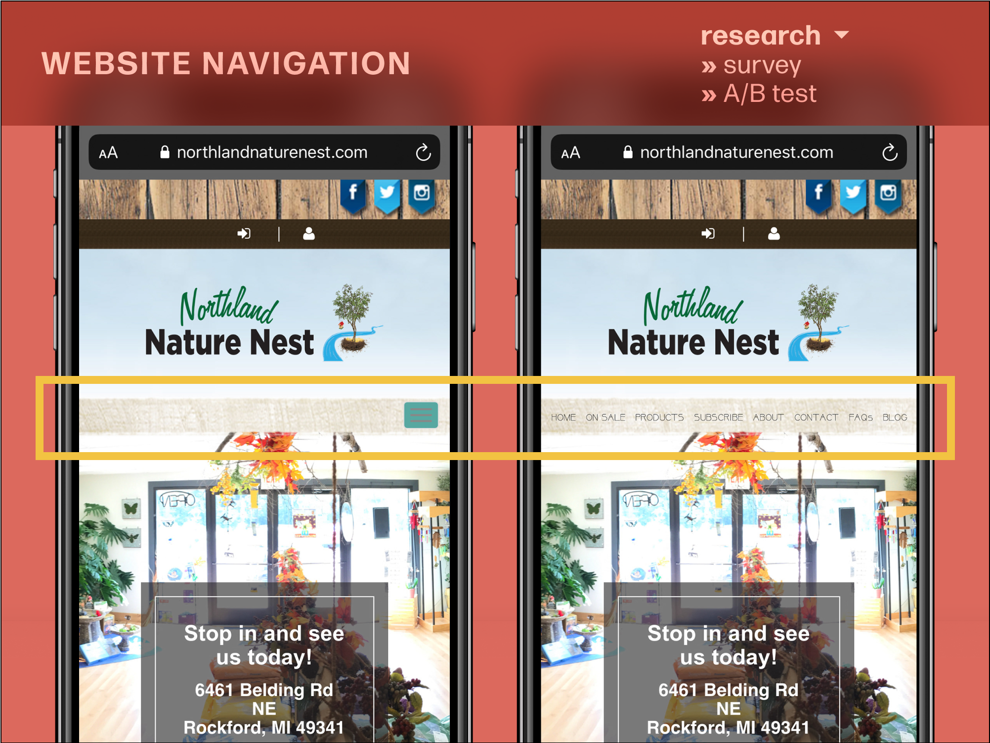
To give the primary stakeholders a clearer sense of for different color palettes might appear on a website, I created a colorful homepage mockup using defined (Figma) color styles to easily swap out and visualize different palettes.
Here's that mockup showcasing the final Connxus brand colors —
THE FINAL PALETTE

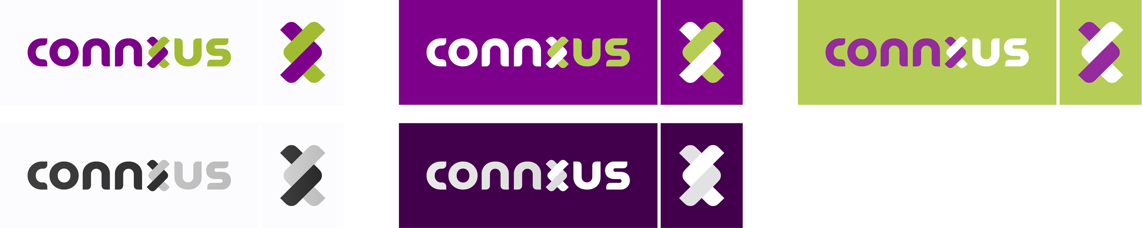
Logo
Logo development began with competitor examples, branched out to consider visual elements' connotations and associations with the five pillars, then raced through iteration after iteration.
[ T L ; D R ] Stakeholders agreed on a primary wordmark to support brand recognition in such a niche market, and a smaller logo figure for situations where the brand is known and space is scant.
[ T L ; D R ] Stakeholders agreed on a primary wordmark to support brand recognition in such a niche market, and a smaller logo figure for situations where the brand is known and space is scant.
The "x" comprised two clasped chevron-shaped arrowheads, each pointing outward from its same-color letter partners—toward the other half of the wordmark. This reinforces the supportive togetherness conveyed by the name.
Here's how we got there...
COMPETITIVE ANALYSIS: LOGOS
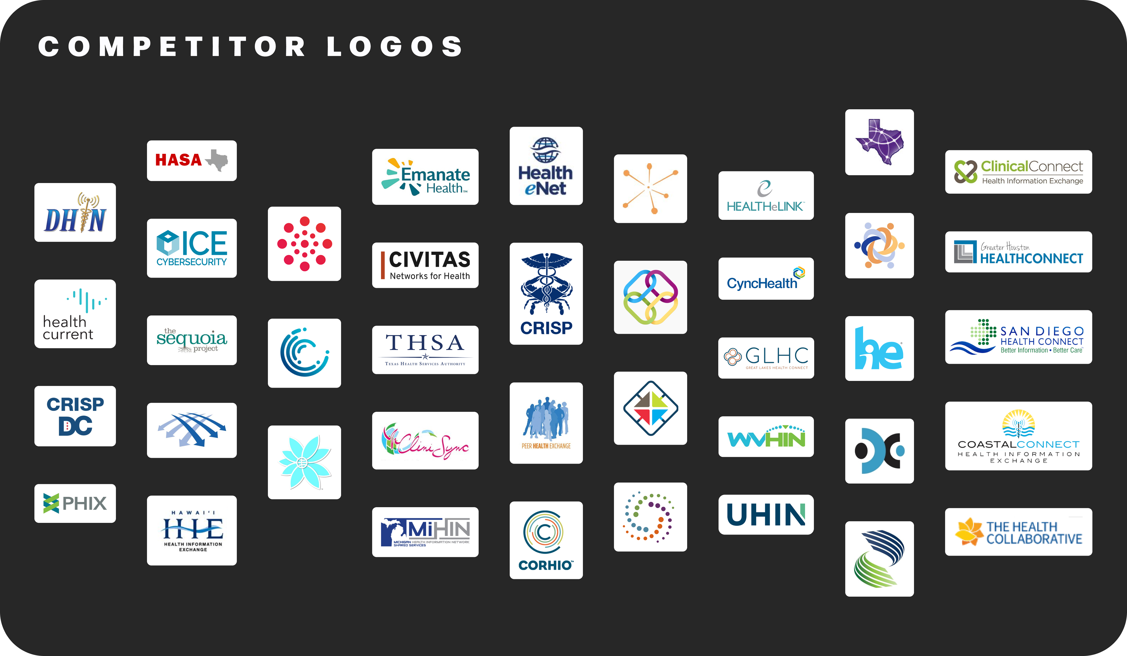
Key Takeaways: Logo Competitive Analysis
Many competitors used simple wordmarks. Those with pictorial or abstract marks tended to employ symbology that:
— incorporated multiple similar elements (often, dots, lines, or simple shapes)
— implied a radiating outward (of data) or a joining together (of HIE member organizations)
— incorporated multiple similar elements (often, dots, lines, or simple shapes)
— implied a radiating outward (of data) or a joining together (of HIE member organizations)
The "joining together" symbology seemed particularly appealing for Connxus, given its emphasis on collaboration and connection.
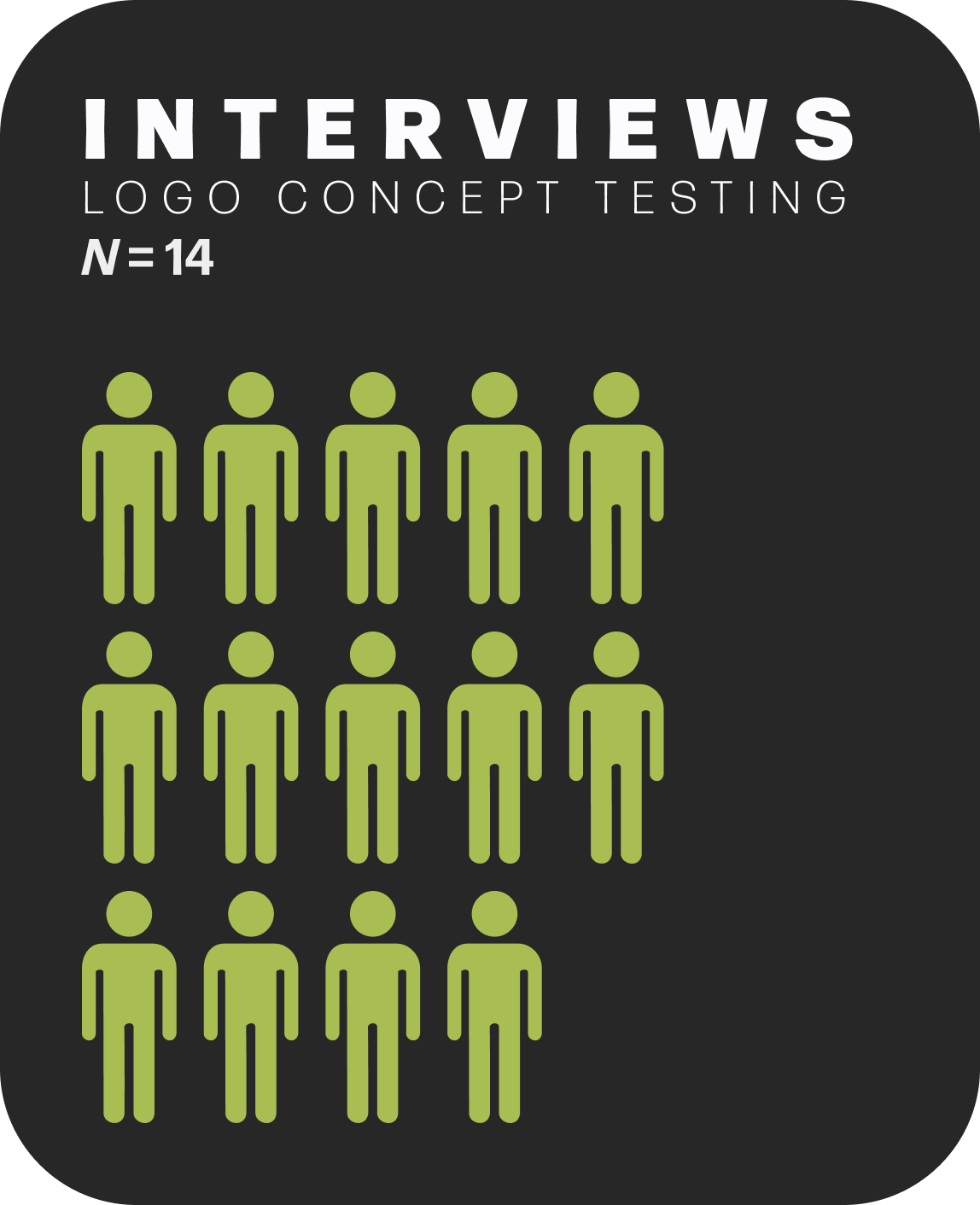
Logo Concept Testing
This being my first time designing a logo that could very well make or break an organization, I decided to conduct some exploratory testing:
What associations and emotions do various shapes, arrangements, and styles evoke in those with some level of HIE knowledge?
I started by crafting a diverse set of grayscale, logo-like patterns intended to convey different Connxus values, then tested them in interviews with 14 HIE-aware participants.
Why interviews?
The interview setting allowed me to delve into the "why" behind participants' answers, which was essential for understanding and synthesizing data on such abstract topics.
The interview setting allowed me to delve into the "why" behind participants' answers, which was essential for understanding and synthesizing data on such abstract topics.
Tested Topics per Logo Pattern
First thing that comes to mind?
Describe in 1-3 words?
Aesthetics?
Vibe/emotion?
Brand/company recognition?
If this image represented a person...
— Personality?
— Trust?
— Want to work with them?
Which best portrays:
— Wellness?
— Wholeness/Completeness?
— Uniqueness?
— Connectedness?
— Trust?
— Innovation?
— Happiness?
— Community?
— Supportiveness?
Key Takeaways: Logo Concept Test


Wellness, happiness, supportiveness, community, trust: Mostly curved, circular/cyclical, human ties, symmetrical


Connectedness, wholeness/completeness: Overlap with the first (wellness) group, but more complex & geometric while maintaining a human component


Uniqueness & innovation: Greater complexity, geometric, sharp corners
Interim Logo Recommendations
At this point in the process, the name (and pillars!) had not yet been decided on. So, this exploration led to more foundational recommendations:
Together, the name, logo, and colors should convey:
— Humanity
— Overall wellness/quality of life
— Connectedness
— Modernity/innovativeness/forward-thinking/strategy
Since the more modern, bold, sharp, and blocky logo shapes tended to be much less well-liked and garnered neutral to negative connotations, the concepts of innovation, strategy, and uniqueness would be better conveyed through a bold, contrasting color palette and a more modern name.
Often, associations with humanity, wellness, joy, and connectedness coincided within logo shapes, especially when connoting a “person,” spiral, or joining together/clasping (e.g., of hands). The last of these ideas would be explored during ideation later for the wordmark.
LOGO IDEATION
—Pre-naming
Before the final decision on a new name, I explored various abstract ways to visualize:
— community, support, & togetherness
— innovation, forward-looking, & growth
— many parts that make a whole
— different symbols for different determinants of health or HIE services
Most ideation incorporated multiple colors (though the palette hadn't yet been finalized) to highlight the organization's many facets (e.g., beyond healthcare), the diverse range of partner organizations, and the organization's bold, welcoming, and inclusive character.

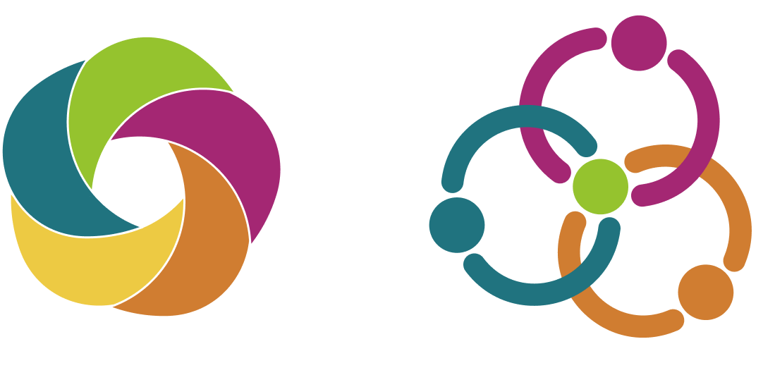
Innovation, forward-looking, & growth
Community, support, & togetherness
Many parts that make a whole
Different symbols for different determinants of health or HIE services
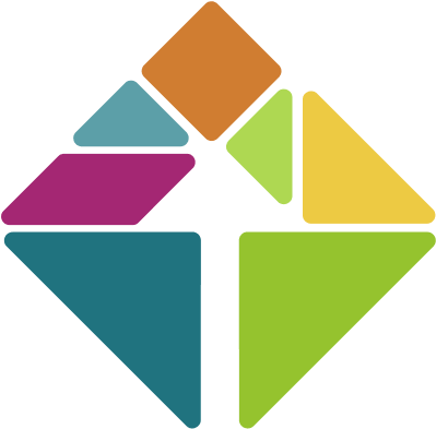
—Post-naming
Once the name—connxus—was settled, wordmark ideation began in earnest.
From the start, the "x" was used as a focal point for visually representing connection is different ways—
Simple, with X acting as a sort of nexus

Ribbon-like connections
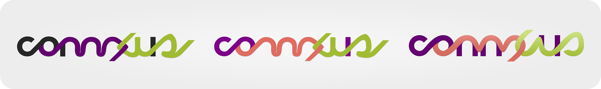
X as a clasp between sides of the logo
FINAL LOGO
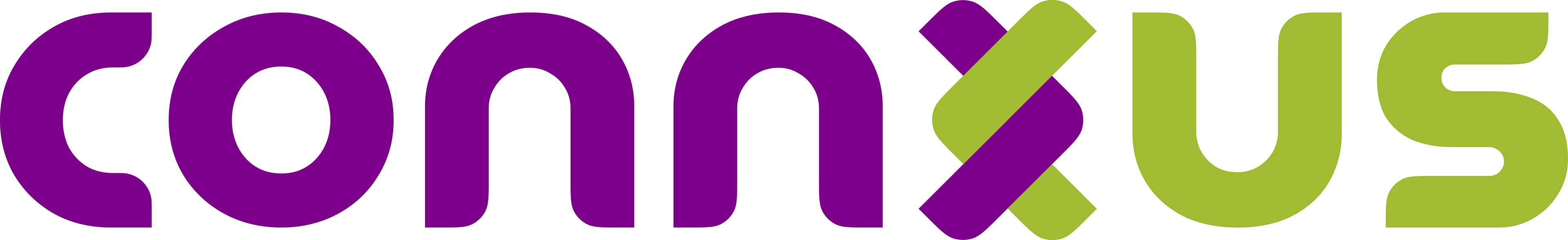
Simple, clear, with an X that clasps sides (like entwined arms or hands).
Base font style mirrors MuseoModerno with rounded inner corners.
Base font style mirrors MuseoModerno with rounded inner corners.
Imagery
Brand imagery guidelines came together comparatively easily: Review competitor styles, adapt relevant ideas, discard those that don't align, expand styles to encompass the core brand identity, then—finally—explore logo-derivative figures.
[ T L ; D R ] Imagery guidelines—primarily photography—aligned with the new brand identity: tech- and data-driven, expansively connected, and cheerfully welcoming, empowering, and community-oriented. Isolated logo elements afforded the new brand a pop of added character, as well.
Here's how we got there...
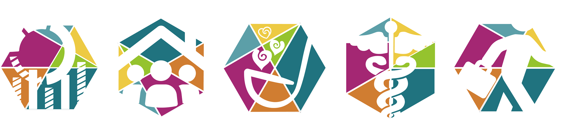
COMPETITIVE ANALYSIS: IMAGERY
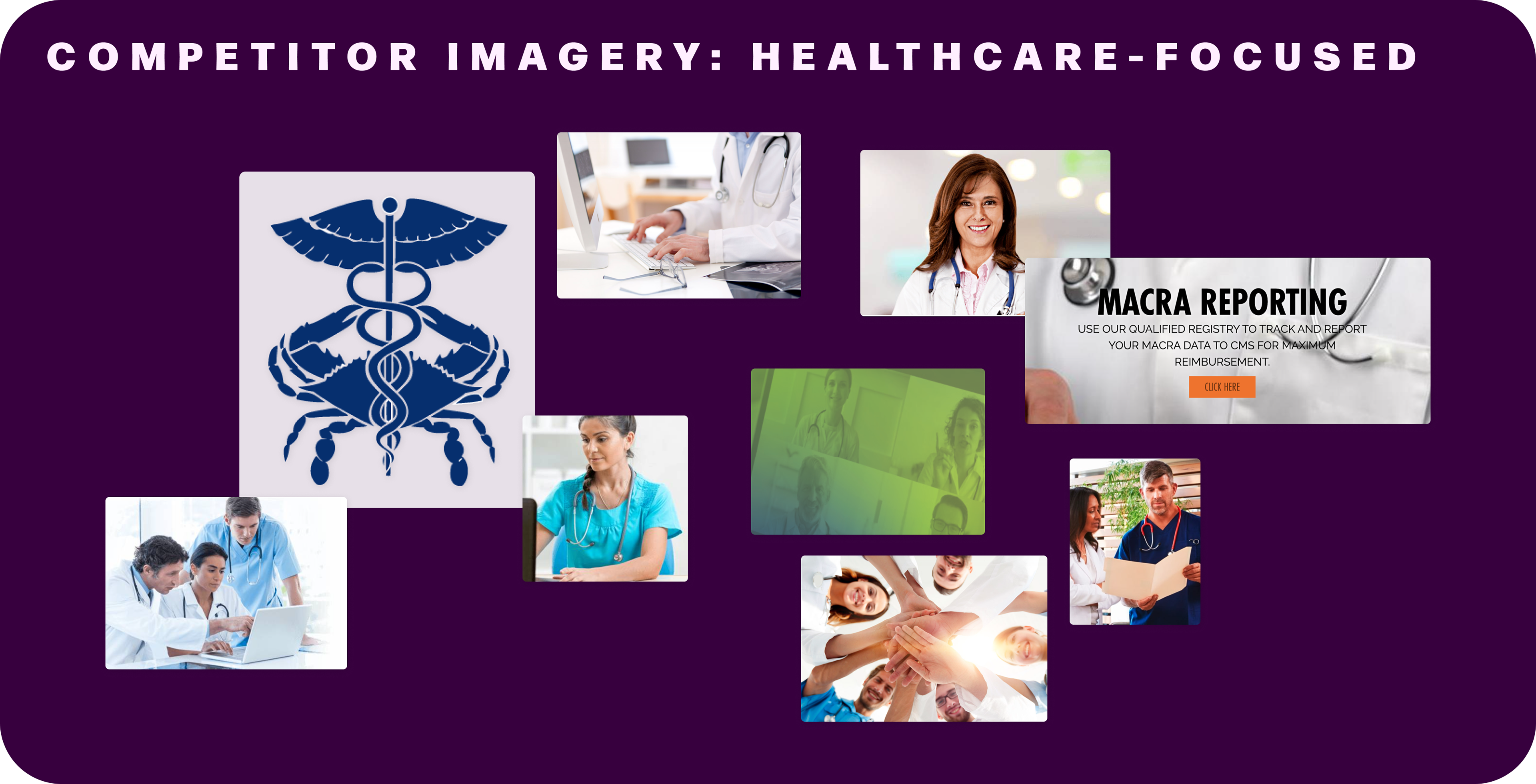
Key Takeaways: Imagery
Most competitors relied heavily on healthcare imagery — stock photos of people in scrubs, patient files, and medical symbols like stethoscopes and the caduceus.
While ICC aimed to move away from this healthcare-centric visual language in their rebrand, the consistent use of technology elements, such as computers, resonated strongly with stakeholders.
FINAL GUIDELINES: IMAGERY
Subjects
People-oriented: include faces and/or expressive gestures; should emphasize just one or a few specific individuals rather than large crowds
Tech—but with a human or connectivity-oriented element
Social determinants of health
Emotions & Feeling
Unity & togetherness
Happiness
Wellness (sans healthcare emphasis)
Strategy & problem-solving
Cutting-edge (tech), but approachable
Colors
Try for images with just one or two major colors, rather than a profusion. Or, if the image is too good to pass up, consider partial desaturation and/or using a gradient overlay from the Connxus palette.
Logo-Derived Figures
Logo fragments
Opposing-radii curvature
Typography
Typeface choice was straightforward:
1 Review competitor fonts
2 Consider type elements that correspond to the core brand identity
3 Discover free, web-friendly font families that showcase each element
4 Align with stakeholders on a font family that best suits their brand voice and personality
[ T L ; D R ] Final choices: Poppins (primary), Lora (secondary), Connxus Text (optional custom font).
Here's how we got there...
COMPETITIVE ANALYSIS: TYPOGRAPHY
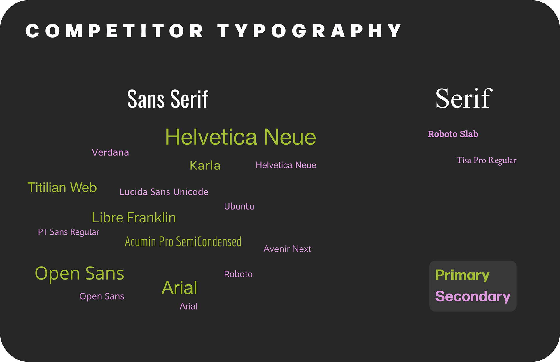
Key Takeaways: Typography
Unsurprisingly, competitors overwhelmingly used sans serif fonts, often with moderate to wide set width—choices that reinforce an open, approachable brand image.
TYPOGRAPHY Ideation
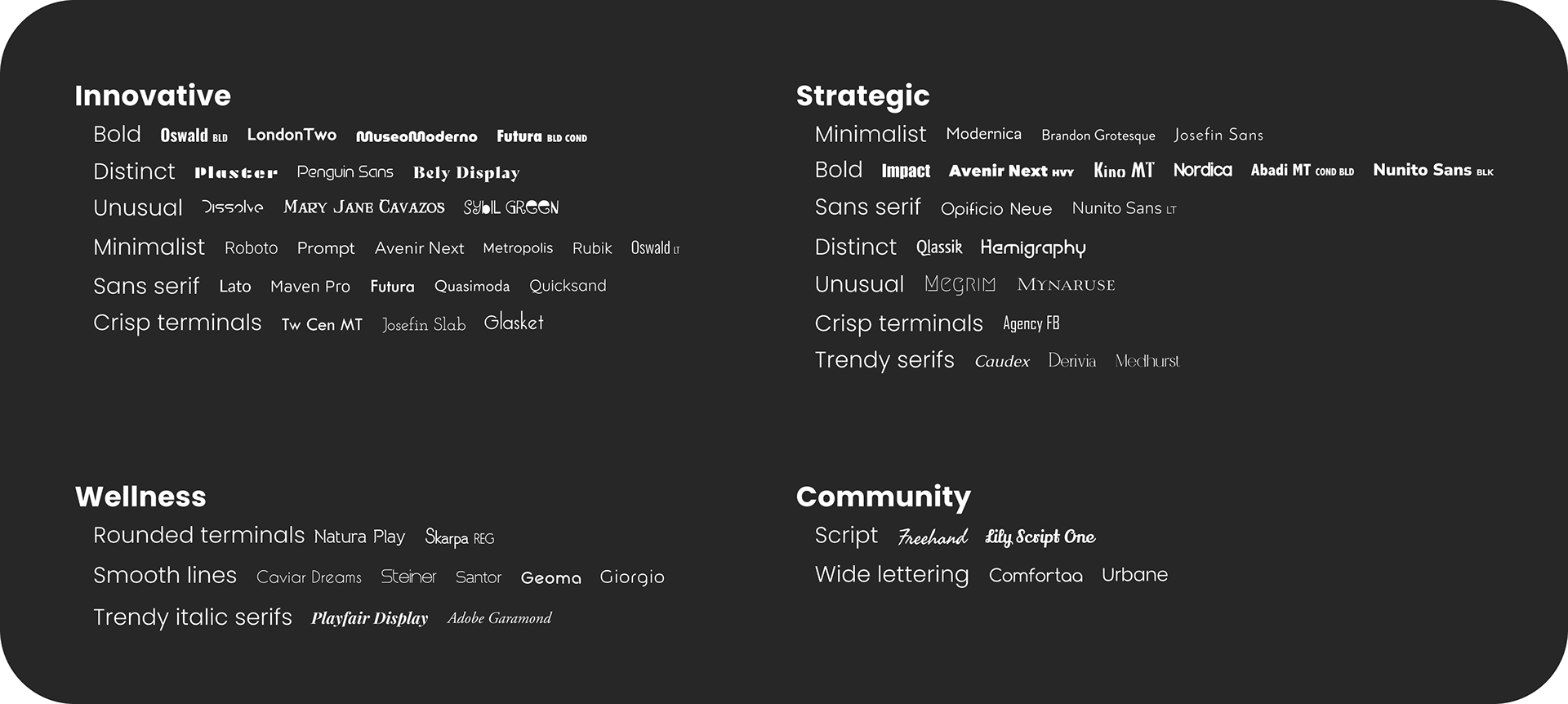
Lots of searches, lists, and associations; focused on free, common fonts (e.g., Google Fonts).
Final TYPOGRAPHY DecisionS
Primary: Poppins
Why?
— It conveys an open "friendliness" or "approachability" while maintaining a polished, modern aesthetic.
— It's easy to read on screens even at small font sizes.
— It's freely available for use.
— Google fonts are likely to render properly on most devices and browsers.
Secondary: Lora, used sparingly
Why?
— It pairs well with Poppins.
— The serif introduces visual variety to content.
— It's freely available for use.
— Google fonts are likely to render properly on most devices and browsers.
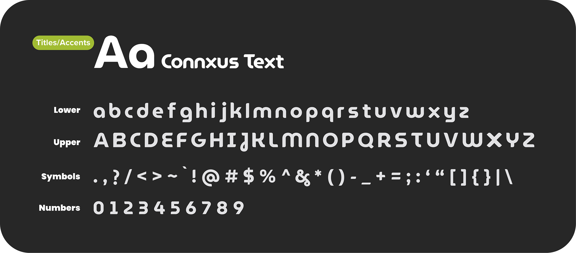
Optional Accent Font: Connxus Text
This font uses the same lettering as the logo, and could be used for headers and interjections in small doses.
This is, however, just a Figma-based mockup of what such a font would look like. I had very little knowledge of font development at the time of this project, so opting to pursue this font would have incurred additional costs—either in time for my learning or in money for a professional who already has that skill.
In the end, I experimented a bit with free font software, but it became clear that my time would be more effectively spent elsewhere.
BRAND REVEAL & OUTCOME
Stakeholders' pre-rebrand worries for the organization's viability are now a thing of the past. The refreshed brand revived the organization, fueling unprecedented growth in new partnerships, offerings, and initiatives. View their new website here: https://connxus.org/.
Take a look at the brand book below to see the full rebrand all in one place —
Questions? Comments? Project ideas? Let's get in touch!
Thanks for reaching out! I'll get back to you as soon as I'm able.